IssueVoter is a civic engagement platform that helps constituents voice their opinions on upcoming legislation and track how their representatives vote. The app bridges the gap between voters and policymakers by turning collective feedback into actionable insight at the district level.
This redesign project focused on improving the mobile experience for politically engaged users who want to participate—but are short on time. Our challenge was to make legislative information more digestible and actions more intuitive, while using data visualization and infographics to turn civic activity into a compelling, trackable experience.
Design Goals:
+ Make civic participation fast, easy, and meaningful
+ Turn dense legislative language into bite-sized summaries
+ Visualize user impact through clear, engaging infographics
+ Create a trustworthy, nonpartisan experience rooted in transparency
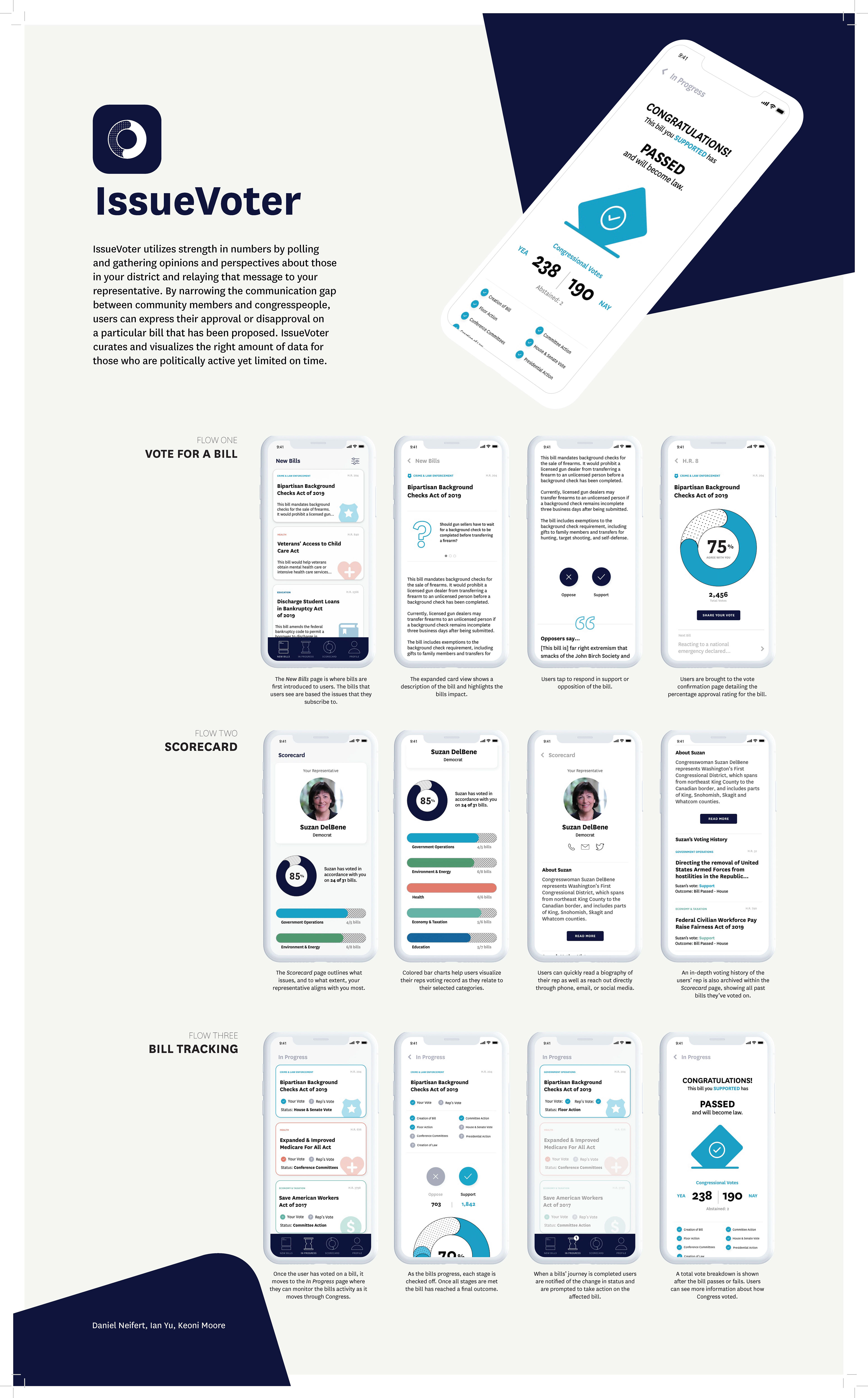
We structured the app into three primary flows, each designed to match user intentions and reduce friction:
Flow One: Vote for a Bill
+ Users begin with a “New Bills” list—categorized and personalized to their interests.
+ Bill cards present title, topic, and category icon
+ Tapping a bill expands it into a brief, digestible summary with issue context and key arguments
+ Users are presented with real-time support data via a circular graph, then vote to approve or oppose the bill
+ This flow ensures decisions can be made in under one minute
Data Visualization Highlight:✓ Interactive support dial showing current approval percentages and time left to vote
Flow Two: Scorecard
+ The Scorecard offers personalized feedback on how well a user’s views align with their congressional representative.
+ Users see a visual “alignment score” with their rep
+ A color-coded bar graph tracks topic-by-topic alignment (e.g., Economy, Health, Environment)
+ Users can view a full rep profile with biography, recent votes, and party info
Data Visualization Highlight:
✓ Topic alignment bar charts and circular rep alignment score for at-a-glance understanding
✓ Topic alignment bar charts and circular rep alignment score for at-a-glance understanding
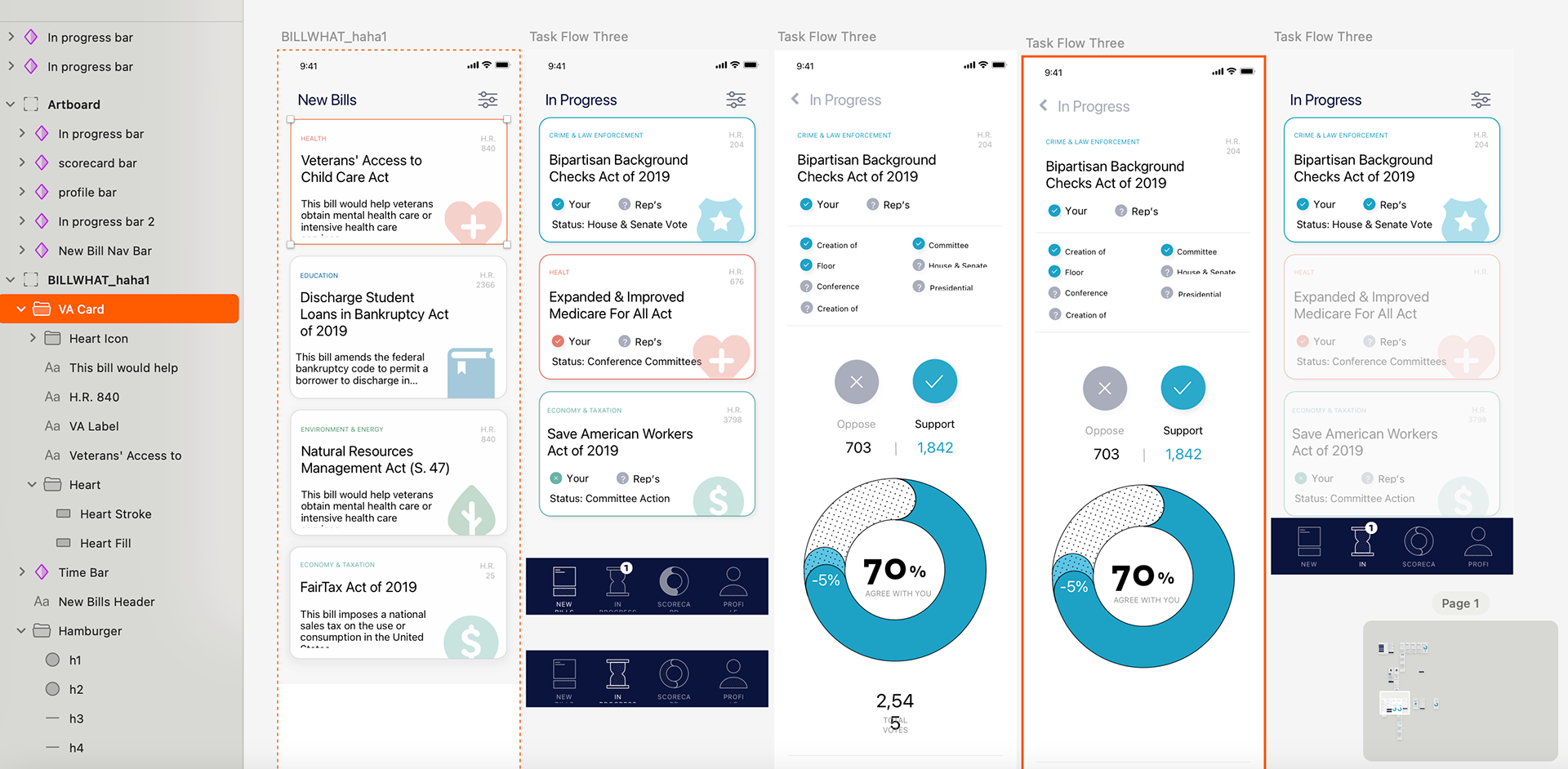
Flow Three: Bill Tracking
+ Once a user votes, that bill enters their In Progress dashboard.
+ Each bill card shows current legislative status (e.g., introduced, committee, passed)
+ A horizontal progress tracker visually marks the bill’s journey
+ Upon completion, users receive a breakdown of final vote counts in both chambers
Data Visualization Highlight:
✓ Horizontal bill timeline with checkmarks
✓ Final vote bar chart comparing House and Senate outcomes
✓ Horizontal bill timeline with checkmarks
✓ Final vote bar chart comparing House and Senate outcomes
Reflection:
This project pushed me to think deeply about how data storytelling, UX clarity, and visual systems can create more informed, more confident communities. It taught me the value of designing for both urgency and trust—and how good design can turn civic overwhelm into civic action.