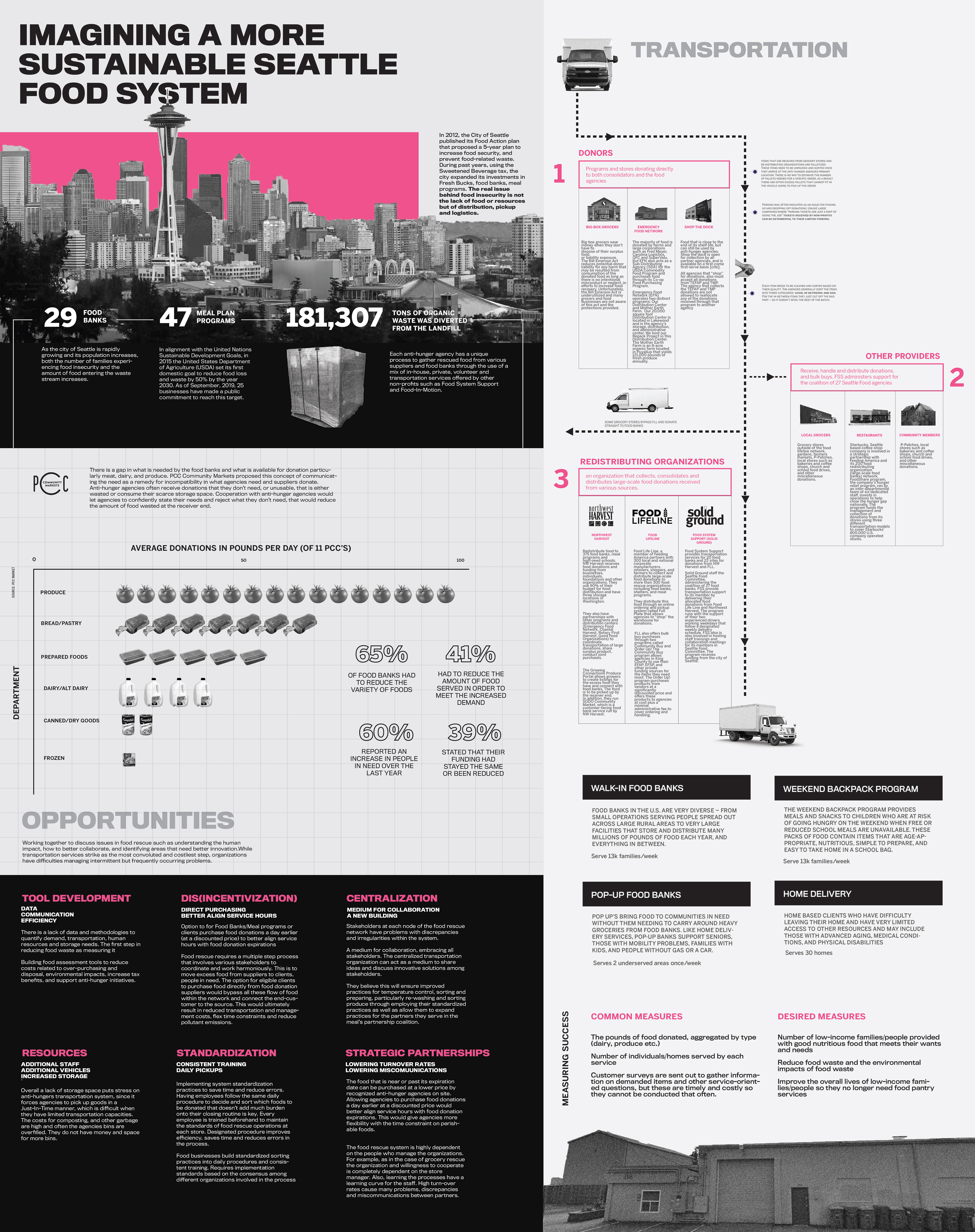
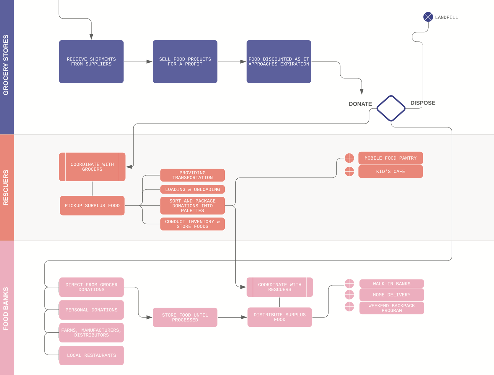
This project visualizes the structure, challenges, and opportunities of Seattle’s emergency food distribution system—from food waste reduction to last-mile delivery. It aims to identify gaps between supply and community access while highlighting potential for policy shifts and partnerships. The visual strategy distills a dense logistical system into a simple, scannable, and sharable civic infographic.
This infographic demonstrates my ability to translate civic infrastructure challenges into clear, community-friendly visuals. Much like a parking equity issue, food distribution requires mapping, clarity, and public trust. This piece speaks directly to the power of visual design in urban planning and public problem-solving.
Project Goals:
+ Map the journey of food from donation → redistribution → community services
+ Visualize pain points in equity, efficiency, and food access
+ Offer a graphic framework to guide conversation between donors, food banks, city leaders, and nonprofits
1. Research & Discovery
We began by studying Seattle’s emergency food distribution system at a citywide level, identifying key players in the pipeline—from donation sources to end-user services. This included understanding the roles of food banks, meal programs, redistribution hubs, and mobile delivery providers.
2. Stakeholder Interviews
To ground our understanding in lived experiences, we conducted interviews with local organizations actively involved in food access. These conversations revealed operational constraints, infrastructure gaps, and nuanced service needs that weren’t visible in public datasets alone.
3. Data Organization & System Mapping
Using insights from interviews and spatial data on donation and distribution routes, we created a working map of Seattle’s food flow. This included tracking where food was sourced, consolidated, and delivered—along with where inefficiencies and drop-offs occurred.
4. Information Architecture & Outline
Based on our research, we developed a visual outline for the infographic. We identified the major components: city-level context, donation breakdowns, redistribution network, service models, and metrics for measuring success. This guided the structure and storytelling of the final design.
5. Visual Design & Illustration
I developed a modular visual system using color-coded sections, icons, and flow diagrams to represent each stage of the food system. Care was taken to create a hierarchy of information that was easy to scan while still rich in content for those engaging more deeply.
6. Accessibility & Multi-Format Testing
The infographic was designed to be legible both on screen and in print. Color contrast, text sizing, and labeling were refined for accessibility, and the layout was tested in poster format, slide presentations, and digital shareables.
Design Features:
+ Hierarchical information flow (top-down supply chain)
+ Statistical graphics: bar charts, pictographs, and grids
+ Iconography for donor types, vehicle movement, and food categories
+ Color-coded sectioning for quick scanning